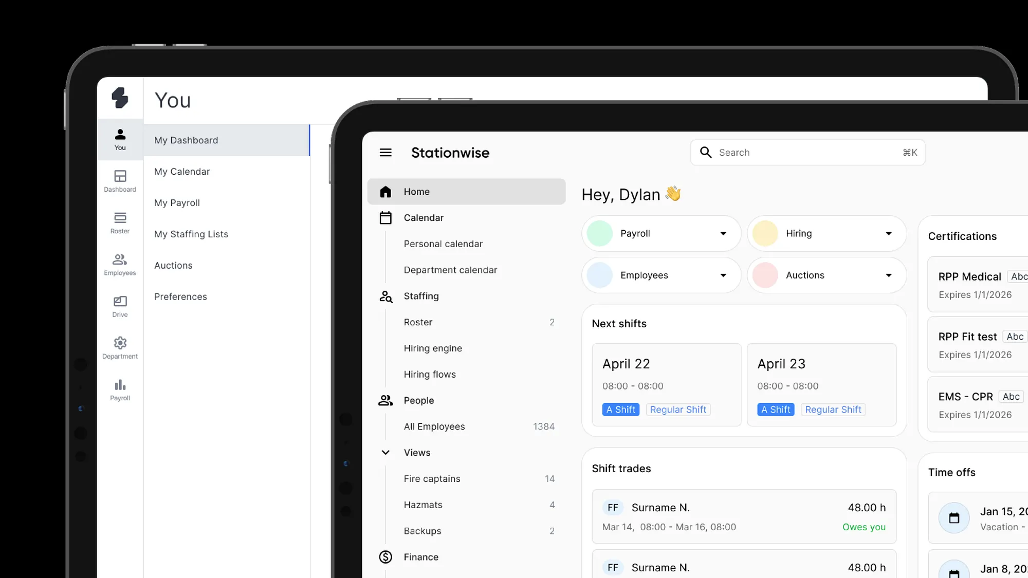



We are a fast-growing startup. We’ve released a lot: hiring engine, rules engine, auction, survey tools, and more features are still on the way. We were in a rush. Probably we will be too, at some point. But in one of our meetings with Murat and Joseph, we said: let’s settle down a bit. Polish the app. Slow down and do things in a more proper way.
This post is about what that actually meant for design.
When I joined the company, we had a very large design system. Many customized things, lots of styling overrides, our own icon set, a complicated color system. It was a lot.
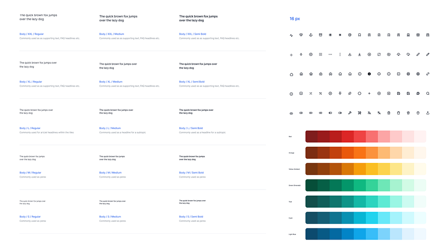
We’re using MUI. And to release this many features fast, we realized we needed to use components in a more basic way. Customizing is good, but we didn’t have enough resources to maintain all of those overrides. Both on the code side and the design side. So we made a decision: remove every override.
Go back to the default MUI typography. Use blue. Use the standard fields. Use Google’s icon set, which they’ve committed to supporting forever.

One thing we couldn’t ignore anymore was navigation. We started with four tabs. It became many more. And there will be even more coming.
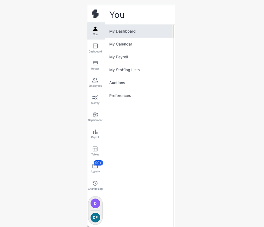
We simply couldn’t scale it. In the Ankara meeting we said: let’s make a systematic solution that covers all the existing features and the new ones, and provides them in a better way.
Navigation is actually defining a lot of things in an app. You see it on every page. It defines the design language, just think about Instagram. The navigation items are everywhere and they define the whole feel. So we started there.
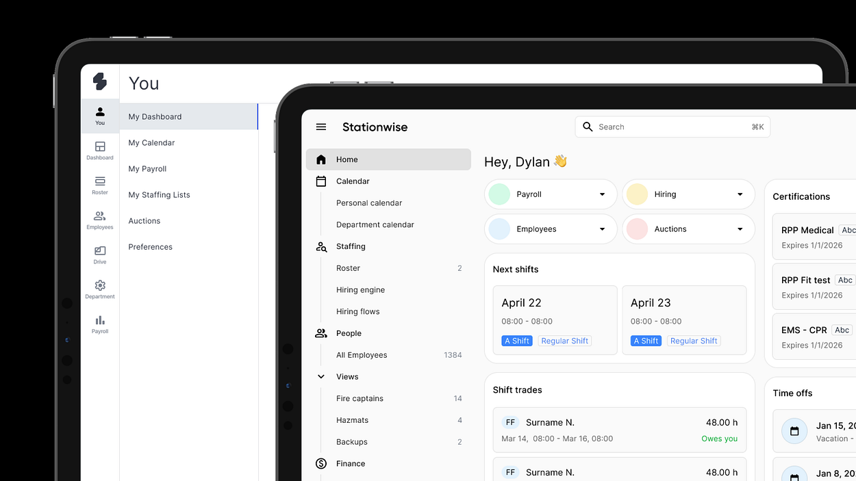
What we got: a top bar that works on both desktop and mobile. A hamburger menu that organizes main tabs and sub-pages in a proper hierarchy. Things like “Fire captains” under People are actually reachable now without having to navigate tab by tab.

This is very scalable. We can even imagine — in the future — letting users choose their own bottom tabs based on their workflow.
An admin has different priorities than a regular user. That kind of personalization isn’t far off.
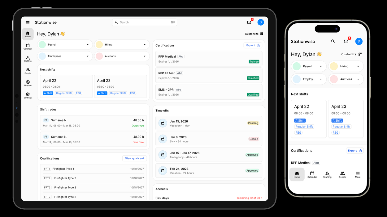
This was a big alignment point with Alperen: use shared components as much as possible. Not just because it looks unified — but because it actually makes our work easier.
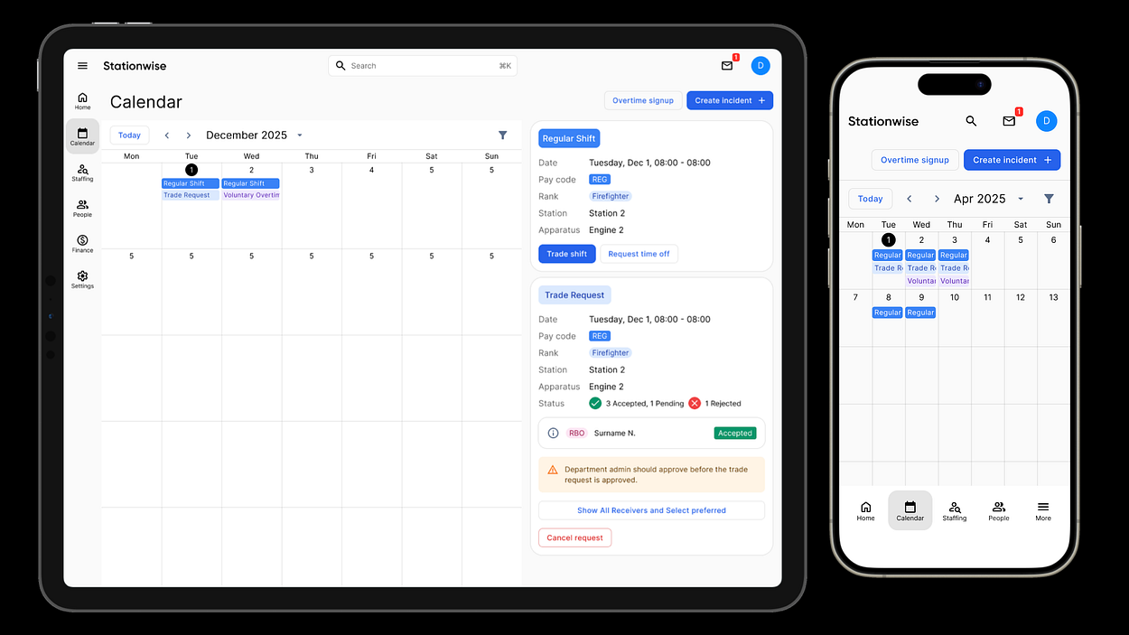
If we’re using the same components, we can copy and paste them from desktop to mobile and they’ll just work. The goal was: let’s not make exceptions for different screen sizes.
Personal calendar page is a good example. Maybe we remove the calendar header on mobile, but we use the same button labels and the same buttons. Consistency in the pieces, even when the layout adapts.
If you need a manual to use a product, it’s probably broken.
One small example: the profile picture icon in the top right. This is a very common pattern. You click it, you get account settings, profile options.

Before, we were putting account settings under “My” tab. That also works, technically. But if users already expect to find it one place, why fight that behavior?
We want to support dark mode. But to do it properly, you have to build the interface with that concern from the beginning. Specifically, you have to pick the right color variables from the start.
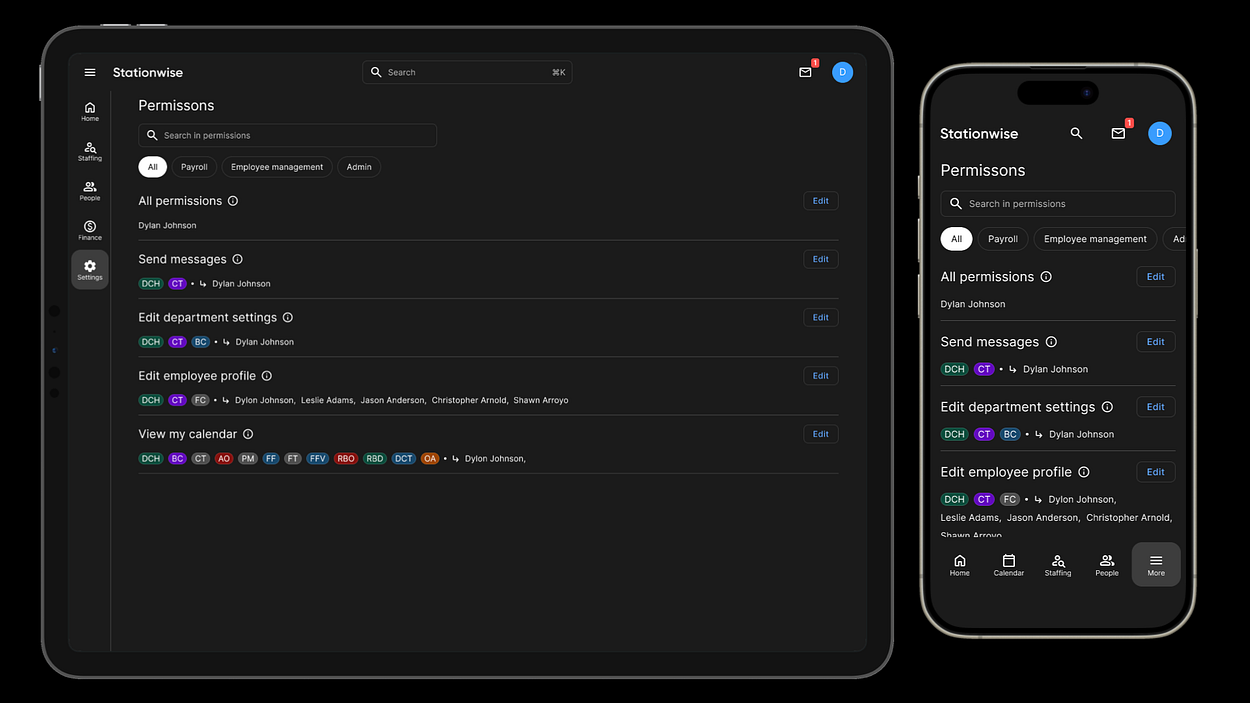
Right now our codebase has too many different color variables. I’m working on simplifying this into a proper color system.
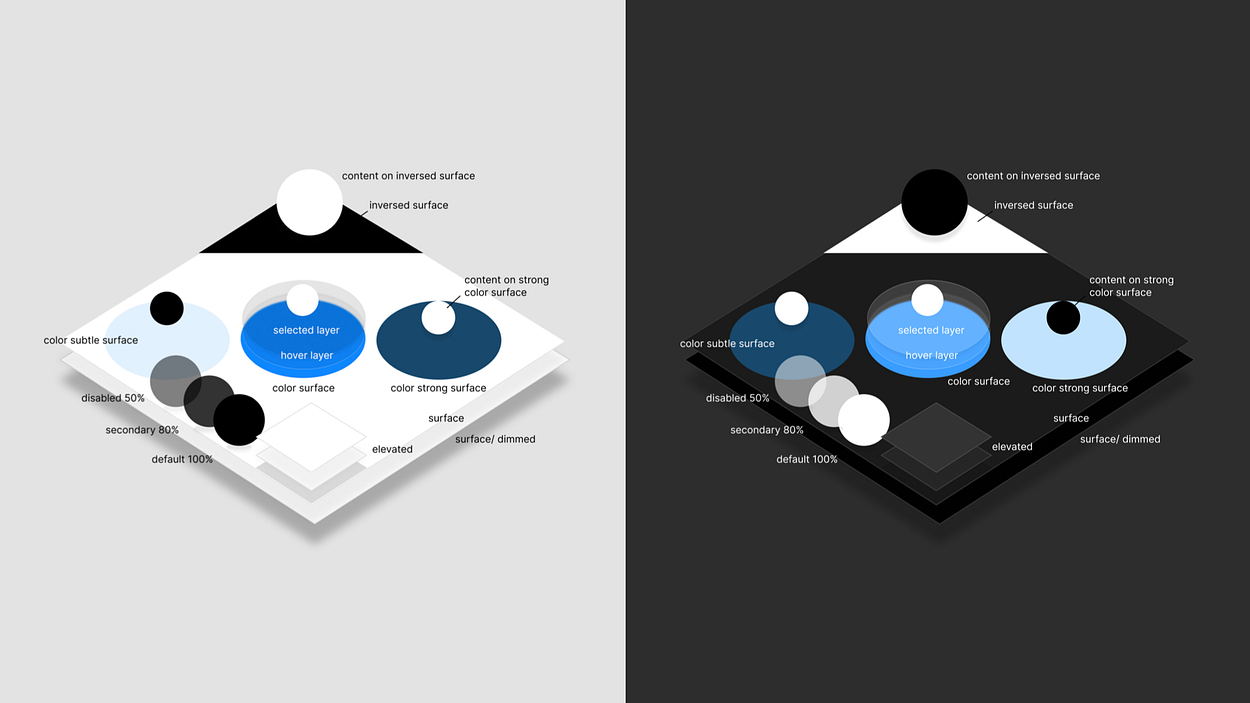
The idea is: subtle, default, and strong versions of each color, and from those you can create every existing component we have plus future ones.
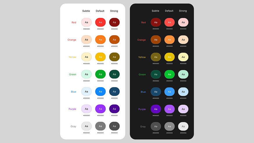
Once this color system is solid, dark mode becomes possible without rebuilding everything.
Design is one of the key things that shows what kind of startup we are. We don’t want to be the startup that ships fast and looks like it. We want both.
The navigation changes, the shared components, the color system, responsive layouts for admin pages… These aren’t separate projects.
They’re part of the same direction.
We’re still working on it. But now we have a system. And that makes the difference.